![CZT [CITI-ZEN-THEORY]](http://czt.rocks/cdn/shop/files/CZT_-_Brand_PINK_Label_1_330x.png?v=1774104725)
![CZT [CITI-ZEN-THEORY]](http://czt.rocks/cdn/shop/t/61/assets/CZT-Fast-Logo---Blue-Grey_330x.png?v=98224836737033641471695502660)
![CZT [CITI-ZEN-THEORY]](http://czt.rocks/cdn/shop/files/CZT_-_Brand_PINK_Label_1_170x.png?v=1774104725)
![CZT [CITI-ZEN-THEORY]](http://czt.rocks/cdn/shop/t/61/assets/CZT-Fast-Logo---Blue-Grey_170x.png?v=98224836737033641471695502660)
Logo Placement on Clothing: Sizing & Placement Guide
For most apparel, the left chest is your default for professional and subtle branding — roughly 3–4 inches wide, sitting 3–4 inches below the collar seam — while center chest, full front, and full back serve high-visibility merch where the composition demands presence. That single rule holds because it mirrors how people read a garment: the eye moves left first, the chest registers at conversational distance, and a well-placed mark reads as intentional rather than decorative.
Quick-reference size chart by placement:
Pick your placement based on purpose first: uniforms and staff wear call for the left chest; merch drops and event gear call for full front or full back. Run a scaled mockup before you commit to production.
Key Takeaways
The most reliable rule in logo placement on clothing is this: match the placement zone to the garment’s purpose, confirm the size against the chart, and never skip the physical mockup before bulk production.
| Point | Details |
|---|---|
| Default left chest for professional wear | 3–4 in wide, 3–4 in below the collar or shoulder seam, centered between center line and armhole. |
| Full front or full back for merch | Adult full-front prints span 10–12 in wide; full-back prints reach 10–14 in, centered on the garment axis. |
| Match method to placement and fabric | Embroidery for left chest and hats; screen print for full-front volume; sublimation on polyester only. |
| Hoodies need pocket clearance | Keep front art at least 6–8 in above the kangaroo pocket; use left chest or split design on zip-ups. |
| Czt for sustainable custom placement | Czt’s custom couture services integrate placement precision with recycled-material production and small-run flexibility. |
Table of Contents
- 1. How front-of-garment placements actually work
- 2. Back placements: from nape to full canvas
- 3. Secondary placements that add hierarchy and detail
- 4. Garment-specific rules you need before you order
- 5. Exact sizes, measurement technique, and template use
- 6. Which decoration method fits which placement and fabric
- 7. Common placement mistakes and the pre-order checklist
- 8. How to pick placement based on what the garment is for
- 9. Why placement decisions matter for sustainable apparel
- 10. A design credo for placement, from Czt
- Czt brings custom placement and sustainable craft together
- Sources
1. How front-of-garment placements actually work
The front of a garment is where most logo placement on clothing decisions live, and each zone carries a distinct visual register — from the restrained authority of the left chest to the raw graphic energy of an oversized front print.
Left chest. At 3–4 inches wide, the left-chest logo is the industry standard for professional apparel. Center it horizontally between the center line and the left armhole seam, and drop it 3–4 inches below the collar or shoulder seam. The result reads as composed and credible — the visual equivalent of a firm handshake. Research from Nielsen Norman Group on reading behavior in left-to-right cultures found that left-positioned marks are recalled more reliably than right-positioned marks, which is the psychological underpinning for why this placement became the default for uniforms and corporate wear.
Center chest. Position a center-chest graphic 2.5–4 inches below the neckline, centered on the garment’s vertical axis. Size ranges from 5–10 inches wide depending on the graphic’s complexity and the garment’s chest width. This zone reads as bold and high-energy — the territory of band tees, skate graphics, and streetwear drops where the composition is meant to stop someone mid-stride.
Full front and oversized front. Full-front prints commonly span 10–12 inches wide on adult garments. Keep the top edge at least 2.5 inches below the collar to avoid the neckline ribbing, and stay clear of any chest pocket. On zip-up garments, a full-front design splits across the zipper, which requires precise alignment in the artwork file — a split that looks intentional is a design choice; one that looks accidental is a production error.
What looks balanced on screen often reads differently on fabric, especially across size runs from S to 3XL.*
Typography-heavy logos benefit from the guidance in typography and streetwear design — wordmarks need more horizontal clearance than icon marks, and a left-chest wordmark that fits a medium may crowd the armhole on a small.
2. Back placements: from nape to full canvas
The back of a garment is the largest uninterrupted canvas in apparel design, and the placement zone you choose signals how much of that canvas you want to own.
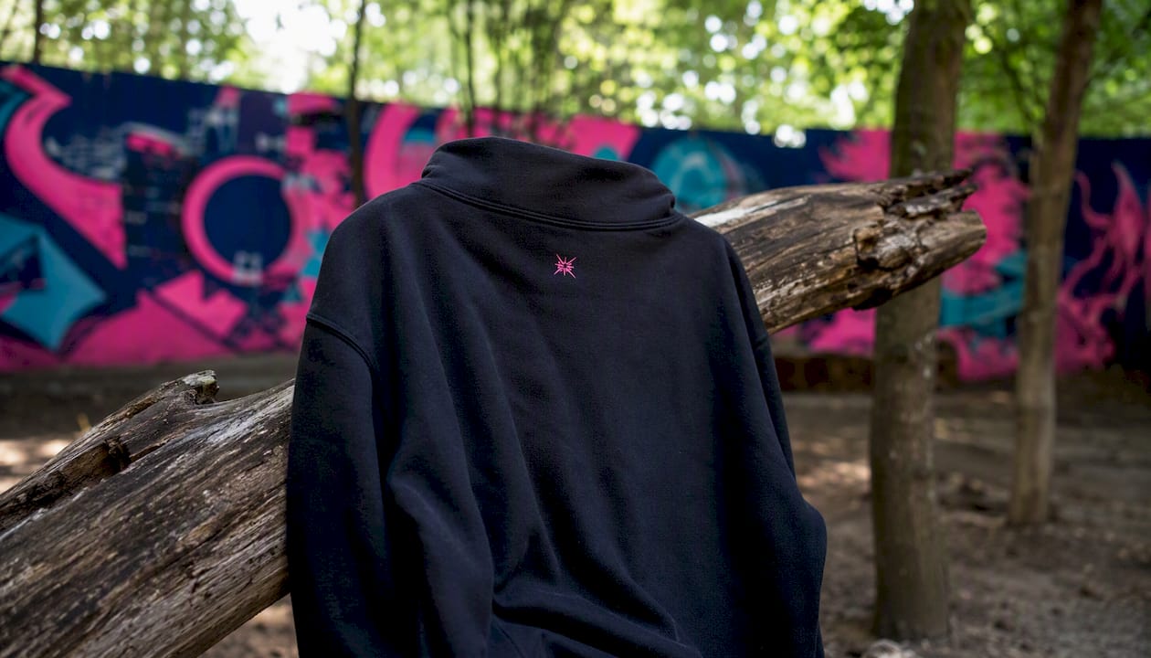
Back collar (nape). A small logo here — typically 2–3 inches wide, placed 1–2 inches below the collar seam — functions as a quiet signature rather than a statement. It reads as secondary branding, the kind of mark that rewards someone standing close enough to notice. This is the zone for brand tags, secondary logos, and collection identifiers.
Upper back. Sitting 4–6 inches below the neckline, the upper-back placement occupies the space between the shoulder blades. It works well for team names, secondary graphics, and wordmarks that need visibility without dominating the full back canvas. Center it on the garment’s vertical axis using the collar seam as your measurement anchor.
Full back and oversized back. Width ranges from 10–14 inches for adult garments, centered between the shoulder seams and the side seams. Drop the top edge 3–4 inches below the collar to clear the seam, and keep the bottom edge above the hem by at least 2 inches. On hoodies, the hood creates a shadow zone at the upper back — position your art lower than you might on a crewneck to keep it visible when the hood is down.
- Back collar: 2–3 in wide, 1–2 in below collar seam
- Upper back: 4–6 in below neckline, centered
- Full back: 10–14 in wide, 3–4 in below collar, 2 in above hem
- Hoodie back: account for hood shadow; shift art slightly lower
3. Secondary placements that add hierarchy and detail
Not every logo needs to anchor the chest or dominate the back. Sleeve marks, hat embroidery, and inside labels create a layered composition — the kind of detail that distinguishes a considered garment from a commodity print.
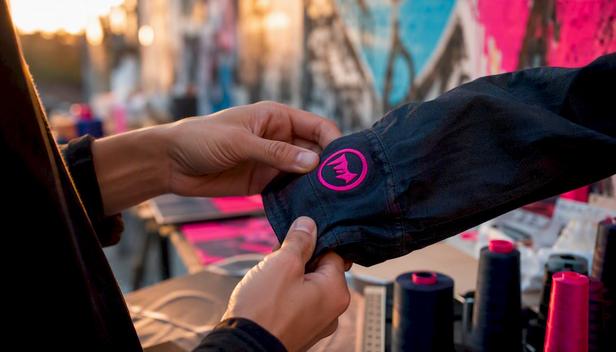
Sleeves. Upper-arm placements read best at 2–3 inches wide, centered on the sleeve cap seam and oriented horizontally. Cuff placements work at the same width but often read better vertically on narrow sleeves. Avoid placing art directly over the sleeve seam, where the fabric folds can distort the print.
Hats. The front panel of a structured hat is height-constrained: keep embroidery or print to roughly 2–2.25 inches tall. Low-profile hats compress that further. Width can extend to the panel edges, but a mark wider than the panel center reads as crowded. Beanies need scaled-down marks on the cuff — approximately 2–2.75 inches wide by 1 inch tall — to remain legible when the cuff folds.
A sleeve logo paired with a left-chest mark creates a layered reading experience: the chest registers first at conversational distance, the sleeve reveals itself as the viewer moves closer or the wearer gestures. That hierarchy — primary mark, secondary accent — is what separates a composed uniform from a garment that simply has a logo on it.
Neck/inside labels and hem/outside tags. Inside labels carry brand information at 1–2 inches wide, printed or woven directly into the garment. Hem tags on the outside of the lower hem function as a subtle brand mark for retail-packaged apparel, typically 1–2 inches wide. Neither placement competes with the primary logo; both reinforce brand presence at close range.
Common secondary pairings that work well: left chest with a sleeve accent, full back with a nape label, and center chest with an inside hem tag.
4. Garment-specific rules you need before you order
Construction differences change everything. A placement that works beautifully on a t-shirt can collide with a polo’s button placket or disappear under a hoodie’s kangaroo pocket.
| Garment | Primary Placement | Key Constraint | Avoid |
|---|---|---|---|
| T-shirt | Left chest or center chest | Scale across sizes S–3XL | Chest pocket overlap |
| Polo | Left chest (embroidery) | 7–9 in down from shoulder seam | Button placket interference |
| Pullover hoodie | Above kangaroo pocket | 6–8 in clearance above pocket | Pocket overlap |
| Zip-up hoodie | Left chest or split front | Zipper alignment required | Unplanned zipper split |
| Jacket/outerwear | Left chest + sleeve | Lining and seam bulk | Back art near shoulder seams |
| Athletic jersey | Back name + number | Numbering standards | Sponsor logo over seams |
Polos deserve particular attention. The button placket runs down the center front, which eliminates center-chest placement as a practical option. Left-chest embroidery, positioned 7–9 inches down from the shoulder seam, is the standard. A knit polo with a structured front gives you a clean embroidery field, but measure from the shoulder seam rather than the collar because polo necklines vary more than crew necks.
Pullover hoodies require you to keep front graphics above the kangaroo pocket, with at least 6–8 inches of clearance. Zip-up hoodies work better with a left-chest mark or a deliberately split design — a graphic that crosses the zipper without planning looks like a production mistake.
Pro Tip: For athletic jerseys, confirm numbering standards with your league or organization before finalizing placement. Many leagues specify number size, font, and back-name height — deviating from those specs can disqualify the garment.
5. Exact sizes, measurement technique, and template use
Precision at this stage prevents costly reprints. Every measurement anchors to a seam, never to a fold or a visual estimate.
Measurement technique. Start from the collar seam or shoulder seam — never from the neckline ribbing, which shifts with wear. Use a flexible tape measure and mark the center line with a removable chalk pen. The three-finger rule offers a quick field check: three fingers stacked below the collar seam approximate 2.5–3 inches, which is the minimum safe drop for any chest placement.
Placement templates are printable grids that overlay a garment’s flat lay, showing safe zones and measurement anchors for each size. When scaling across sizes, the artwork width typically stays fixed while the garment grows around it — a 3.5-inch left-chest logo reads proportionally on a medium and a 2XL. For guidance on adapting artwork across garment types, the personal artwork integration guide covers scaling and composition in detail.
Pre-order verification checklist:
- Artwork file is vector or 300 DPI minimum at print size
- Mockup reviewed at 100% scale on the actual garment
- Placement measurements confirmed from collar/shoulder seam
- Contrast tested on the garment color (not just on screen)
- Print method matched to fabric type
- Sample approved before bulk production run
6. Which decoration method fits which placement and fabric
The method you choose shapes the placement you can use. Some combinations are natural; others are production failures waiting to happen.
Embroidery is the most durable option and the natural fit for left-chest marks, hats, and sleeve accents. The stitch field on a standard left-chest placement maxes out at roughly 4 inches wide — beyond that, the thread density adds weight and stiffness. Embroidery on thin seams or over zippers distorts the stitching and risks puckering. For sustainable apparel made from recycled fabrics, custom embroidery tends to outlast the garment itself, which aligns with a low-waste philosophy.
Screen printing is cost-effective at volume and the standard for full-front and full-back prints on cotton and cotton-poly blends. The screen printing process requires a separate screen per color, so complex multicolor artwork raises costs quickly. It is not suited to small runs or highly detailed gradients.
DTG (direct-to-garment), DTF (direct-to-film), and sublimation each serve different needs. DTG and DTF handle detailed, full-color artwork well and suit small runs, but DTG performs poorly on dark fabrics without a white underbase, and both methods show reduced durability on heavy knits. Sublimation produces vivid, wash-resistant prints but works only on polyester or high-poly-blend fabrics — placing a sublimation print on a cotton garment is not possible. For a direct comparison of DTF and screen printing, the DTF vs. screen printing guide covers the tradeoffs clearly.
| Method | Best Placements | Fabric Compatibility | Avoid |
|---|---|---|---|
| Embroidery | Left chest, hat, sleeve | Most wovens and knits | Thin seams, zippers |
| Screen print | Full front, full back | Cotton, cotton-poly | Small runs, gradients |
| DTG | Center chest, full front | Light cotton | Dark fabrics without underbase, heavy knits |
| DTF | Any placement | Most fabrics | High-stretch zones |
| Sublimation | Full front, full back | Polyester only | Cotton or natural fibers |
7. Common placement mistakes and the pre-order checklist
Most production errors are visible in a mockup if you know what to look for. The most common mistakes share a pattern: they stem from skipping the verification step, not from ignorance of the rules.
Frequent errors:
- Logo sized too large for the placement zone, overwhelming the garment’s composition
- Poor contrast between logo color and fabric color, making the mark illegible at distance
- Artwork placed over a chest pocket, zipper, or seam without accounting for the obstruction
- Low-resolution raster files submitted for large-format prints, producing pixelated output
- Inconsistent placement measurements across garment styles in the same order
Remediation:
- Size error: return to the size chart and scale the artwork in the design file, not in the print software
- Contrast error: test the logo on a physical swatch or a color-accurate digital mockup before approving
- Obstruction error: measure from the seam or pocket edge and adjust the placement anchor point
- Resolution error: request a vector file from the designer or redraw the mark at the required DPI
- Inconsistency error: create a placement spec sheet with measurements for each garment style and share it with the decorator
Pre-order checklist (run through this before confirming any bulk order):
- Artwork file is vector (.AI, .EPS, .SVG) or 300 DPI minimum at final print dimensions
- Mockup reviewed at 100% scale, printed on paper and placed on the garment
- Placement measured from collar seam or shoulder seam, not from a fold or visual estimate
- Contrast verified on the actual fabric color under natural light
- Print method confirmed as compatible with the fabric content
- Placement spec sheet shared with the decorator for all garment styles in the order
- At least one physical sample approved before the bulk run begins
8. How to pick placement based on what the garment is for
Purpose is the first filter. Before you choose a zone, answer four questions: Who wears it? Where will it be seen? At what distance? And what tone does the brand need to project?
- Uniforms and staff wear. Left chest, 3–4 inches wide. The placement reads as professional and legacy, the visual grammar of institutional apparel. Pair with a back-collar label for brand reinforcement at close range.
- Event and volunteer gear. Large back print or full front, 10–12 inches wide. Visibility at crowd distance is the priority; subtlety is not. Bold color contrast amplifies legibility.
- Merch drops and limited editions. Oversized front or full back, 10–14 inches. The composition is the statement. An oversized front placement on a retail tee signals confidence in the artwork and appeals to the streetwear sensibility that prizes graphic scale.
- Retail-packaged apparel. Neck label plus a subtle left-chest mark. The inside label carries brand and care information; the chest mark is the public-facing identity. This pairing is standard for brands that want shelf presence without a loud graphic.
- Streetwear and skate culture. Center chest or oversized front, often paired with a sleeve accent. The composition rewards close reading — a primary mark that registers at distance, a secondary detail that reveals itself up close.
Cost and visibility tradeoffs for multi-location printing:
- Chest plus sleeve: moderate cost increase, high compositional value for uniforms and team gear
- Chest plus back: higher cost, maximum brand coverage, standard for event and merch apparel
- Chest plus nape label: low cost increase, subtle layering, ideal for retail and premium basics
For teams and groups needing consistent placement across multiple garment styles, the matching group outfits guide covers how to maintain visual coherence across a full kit.
9. Why placement decisions matter for sustainable apparel
Placement is not only a design choice — it is a durability decision, and durability is the foundation of responsible production. A logo placed over a high-stress zone (a seam, a zipper, a pocket edge) degrades faster than one placed on a stable field of fabric, which means more returns, more waste, and a shorter garment lifecycle.
Choosing embroidery over a low-quality heat transfer for a left-chest mark on a recycled-material garment is a sustainability decision as much as an aesthetic one. Embroidery, as noted in the print methods section, tends to outlast the garment itself. Minimizing unnecessary multi-location prints reduces ink consumption and the chemical load associated with certain print processes, which matters when the base fabric is already carrying an environmental credential.
Practical sustainability tips for placement decisions:
- Choose embroidery or high-quality DTF for workwear and uniforms that will be washed frequently
- Limit multi-location prints to placements that serve a clear compositional or functional purpose
- Prefer water-based inks for screen printing on recycled or organic fabrics
- Confirm that the decoration method is compatible with the fabric’s recycled content before ordering
Pro Tip: Consistent placement across a brand’s garment range reduces inventory confusion and return rates. When every hoodie carries the left-chest mark at the same coordinates, customers know what to expect — and that predictability is itself a form of brand equity.
Czt’s approach to custom couture integrates these considerations from the first design conversation. Recycled-material collections like the Botanic Camo line are built with placement durability in mind, because a garment that holds its mark through years of wear is a garment that doesn’t end up in a landfill.
10. A design credo for placement, from Czt
Three rules govern every placement decision in our work. Default to the left chest for anything professional or institutional — it is the placement that carries the most cultural weight per square inch of fabric. Move to center chest or full back when the garment is the message, when the composition needs to breathe and the artwork deserves the canvas. And always, without exception, mock it up at scale before committing to production.
The most instructive placement decision is often the one you almost got wrong. A full-back graphic that looked proportional on a flat digital mockup can read as undersized on a 2XL hoodie when the hood is down and the fabric is relaxed. That gap between screen and garment is where placement templates earn their value.
For custom couture projects where the placement is part of the design concept itself, consult with a specialist who can evaluate the garment’s construction alongside the artwork. Measurement templates are a starting point; a skilled eye is the finishing step.
Czt brings custom placement and sustainable craft together
Czt is built for the reader who wants placement done right the first time, on materials that carry an environmental conscience. Where standard decorators treat placement as a checkbox, Czt’s custom couture design services approach it as a compositional decision — one that considers the garment’s construction, the artwork’s scale, and the fabric’s behavior under the chosen decoration method.
Working from recycled materials and small-run production, Czt serves eco-conscious individuals, skateboarders, and families who want apparel that holds its mark and its values across years of wear. Whether you need a left-chest embroidery on a sustainable crewneck or a full-back graphic on a recycled-blend hoodie, the process begins with a placement consultation that accounts for every variable covered in this guide. Request a sample or book a couture design consultation at Czt to see how considered placement and responsible materials work together.
Sources
Placement charts and mockup tools are only as useful as the sources behind them. These resources cover the technical and creative dimensions of logo placement on clothing in depth.
- Logo on Clothing Guide: Best Placement, Sizes & Printing Methods | Designhill
- Design and logo placement on t-shirts | FourthWall
- Ultimate Logo Placement Guide: Shirts, Hoodies & Hats – Local Threads
- Logo placement and brand recall | Nielsen Norman Group
- Hoodie logo placement guide | Printify
Printable placement templates are available through most professional print-on-demand platforms and decorator networks.
Recommended
- How Board Graphics Influence Clothing: A Designer’s Guide – CZT [CITI-ZEN-THEORY]
- Types of Custom Clothing Personalization Options Explained – CZT [CITI-ZEN-THEORY]
- How to Incorporate Personal Artwork into Clothing – CZT [CITI-ZEN-THEORY]
- How to Design Matching Custom Group Outfits – CZT [CITI-ZEN-THEORY]