![CZT [CITI-ZEN-THEORY]](http://czt.rocks/cdn/shop/files/CZT_-_Brand_PINK_Label_1_330x.png?v=1774104725)
![CZT [CITI-ZEN-THEORY]](http://czt.rocks/cdn/shop/t/61/assets/CZT-Fast-Logo---Blue-Grey_330x.png?v=98224836737033641471695502660)
![CZT [CITI-ZEN-THEORY]](http://czt.rocks/cdn/shop/files/CZT_-_Brand_PINK_Label_1_170x.png?v=1774104725)
![CZT [CITI-ZEN-THEORY]](http://czt.rocks/cdn/shop/t/61/assets/CZT-Fast-Logo---Blue-Grey_170x.png?v=98224836737033641471695502660)
How Board Graphics Influence Clothing: A Designer's Guide
Board graphics are the primary visual force shaping clothing aesthetics and brand identity in streetwear, functioning not as decoration but as cultural declarations that precede every other garment attribute in the consumer’s perception. Before a person reads a brand name or feels the fabric, they see the graphic, and that first visual contact, as streetwear culture confirms, determines everything that follows. The garment itself becomes the medium; the graphic is the message.
Understanding how board graphics influence clothing means recognizing that these compositions carry subcultural weight accumulated over decades, from the totemic imagery of 1980s skateboard decks to the all-over sublimation prints defining contemporary apparel. Research into skateboard graphic culture confirms that boards function as lifestyle paraphernalia communicating aesthetics, orientations of style, and identity, and that same communicative power transfers directly onto the clothing that carries those graphics. Designers and brand managers who treat graphics as strategic brand assets, rather than seasonal decoration, build the kind of visual recognition that outlasts any single collection.
The relationship between board graphic design in fashion and apparel aesthetics operates across several interconnected dimensions:
- Graphics serve as cultural shorthand, signaling community membership and brand philosophy in a single composition.
- Consistent graphic style and placement across apparel lines build recognition so strong that audiences identify the brand before reading any text.
- The printing technique chosen to render a graphic directly shapes its tactile presence, color fidelity, durability, and ultimately its emotional resonance on the garment.
- Offering multiple graphic options for a single product empowers consumers to select what fits their identity, broadening brand appeal without diluting visual coherence.
- Core graphics, those recurring motifs and symbols beyond the primary logo, function as a brand’s visual wardrobe, enabling identity expression across formats from apparel to packaging to digital media.
The printing method you choose to execute a board-inspired graphic is not a production afterthought. It determines whether a composition reads as bold and tactile or photographic and refined, whether it survives two hundred wash cycles or fades after twenty, and whether it positions the garment as a premium collectible or an accessible everyday piece. What follows is a detailed examination of each major technique, grounded in the realities of 2026 apparel production.
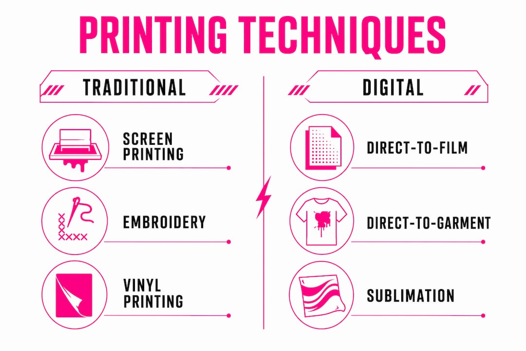
1. Screen printing and puff printing: bold, tactile classics
Screen printing remains the foundational technique for clothing graphics inspired by board culture, and for good reason. The process forces ink through a mesh screen onto fabric, building up dense, opaque color layers that read with the same graphic authority as a deck’s underside. The result is a print with genuine physical presence, one you can feel with your fingertips, which aligns perfectly with the tactile, subcultural authenticity that board-inspired apparel demands.
Puff printing extends this tradition by incorporating a heat-activated additive into the ink, causing the graphic to rise from the fabric surface and create a three-dimensional, embossed effect. That raised texture adds a premium, almost sculptural quality to logos and type, making it a favored choice for statement pieces where the graphic needs to command attention from across a room.
Pros and cons:
- Pro: Exceptional color opacity and vibrancy on both light and dark fabrics.
- Pro: Highly durable; plastisol inks resist cracking and fading through repeated washing.
- Pro: Cost-effective at scale, with per-unit costs dropping significantly for larger production runs.
- Con: Setup costs (screens, separations) make small runs expensive relative to output.
- Con: Limited capacity for fine gradients, photographic detail, or designs with more than six or seven colors.
- Con: Puff printing adds thickness that can feel stiff on lightweight garments.
Pro Tip: When designing for screen printing, treat color limitations as a creative constraint rather than a restriction. The most iconic board graphics of the 1980s and 1990s worked with three or four colors, and that economy of palette is precisely what gave them their graphic power.
2. Direct-to-film (DTF) printing: flexibility for small-batch production
Direct-to-film printing has become one of the most significant shifts in apparel graphic production over the past several years, particularly for brands that need to move quickly and test designs before committing to large runs. The process involves printing a graphic onto a specialized film, applying a hot-melt adhesive powder, curing it, and then heat-pressing the resulting transfer onto the garment. The film acts as an intermediary, which means the graphic can be applied to virtually any fabric type, including cotton, polyester, nylon, and blends, without the substrate limitations that constrain other methods.
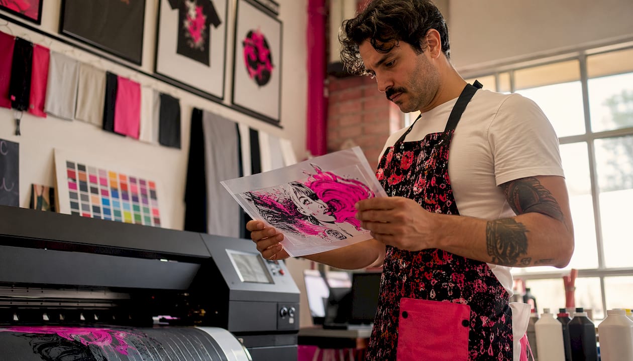
The visual output of DTF is notably smooth, with fine detail and full-color gradients that would require a dozen screens to approximate in traditional screen printing. For board-inspired graphics that incorporate complex illustrative work, photographic textures, or intricate linework, DTF delivers that complexity at a fraction of the setup cost. The slight raised texture of the transfer film is perceptible to the touch, which some designers use deliberately to add a subtle tactile dimension.
Pros and cons:
- Pro: No minimum order quantities; one-off samples are as economical as batch runs.
- Pro: Full-color, high-resolution output including gradients and photographic detail.
- Pro: Compatible with nearly any fabric type, including dark and textured materials.
- Con: The transfer layer sits on top of the fabric, which can feel less integrated than direct-print methods on very lightweight garments.
- Con: Wash durability, while good, tends to be slightly lower than plastisol screen printing over extended use.
- Con: Large all-over prints require tiling multiple transfers, which can introduce visible seams.
Pro Tip: DTF is ideal for rapid prototyping. Print a single sample, wear-test it for a week, and assess how the graphic holds up before committing to a production run. That process saves both money and material waste.
3. Direct-to-garment (DTG) printing: photographic detail on fabric
Direct-to-garment printing operates on the same principle as a desktop inkjet printer, but scaled and adapted for fabric. Water-based inks are fired directly into the fibers of the garment, producing prints with a level of photographic detail and color range that no other method approaches. For board-inspired graphics that incorporate painterly illustration, photographic collage, or intricate tonal work, DTG is the technique that renders those compositions most faithfully.
The DTG process works best on 100% cotton fabrics with a tight weave, where the ink bonds most effectively with the fibers. Pre-treatment of the garment, particularly for dark fabrics, is essential to achieving accurate color reproduction. The resulting print has a soft hand feel, almost as though the graphic is part of the fabric itself rather than sitting on top of it, which gives DTG-printed garments a wearability that heavier print methods cannot match.
Pros and cons:
- Pro: Unlimited color range and photographic detail with no additional cost per color.
- Pro: Soft hand feel; the print integrates into the fabric rather than sitting on the surface.
- Pro: No setup costs or screens; each print can be unique, making it ideal for limited editions and custom pieces.
- Con: Print durability is lower than screen printing; colors can fade more quickly without proper washing care.
- Con: Best results require 100% cotton; performance fabrics and polyester blends produce inconsistent output.
- Con: Production speed is slower than screen printing for large runs, raising per-unit costs at volume.
Pro Tip: For DTG on dark garments, always request a pre-treatment sample before approving a production run. The white underbase layer determines color accuracy, and variations in pre-treatment application can shift the entire tonal register of a complex graphic.
4. Embroidery: the premium graphic finish that endures
Embroidery occupies a distinct position in the apparel graphic toolkit, one that carries connotations of craftsmanship, heritage, and institutional authority that no printed method can replicate. The process stitches thread directly into the fabric using a digitized file that guides an embroidery machine through thousands of individual needle passes, building up a graphic with genuine three-dimensional texture and a visual weight that reads as premium across every context.
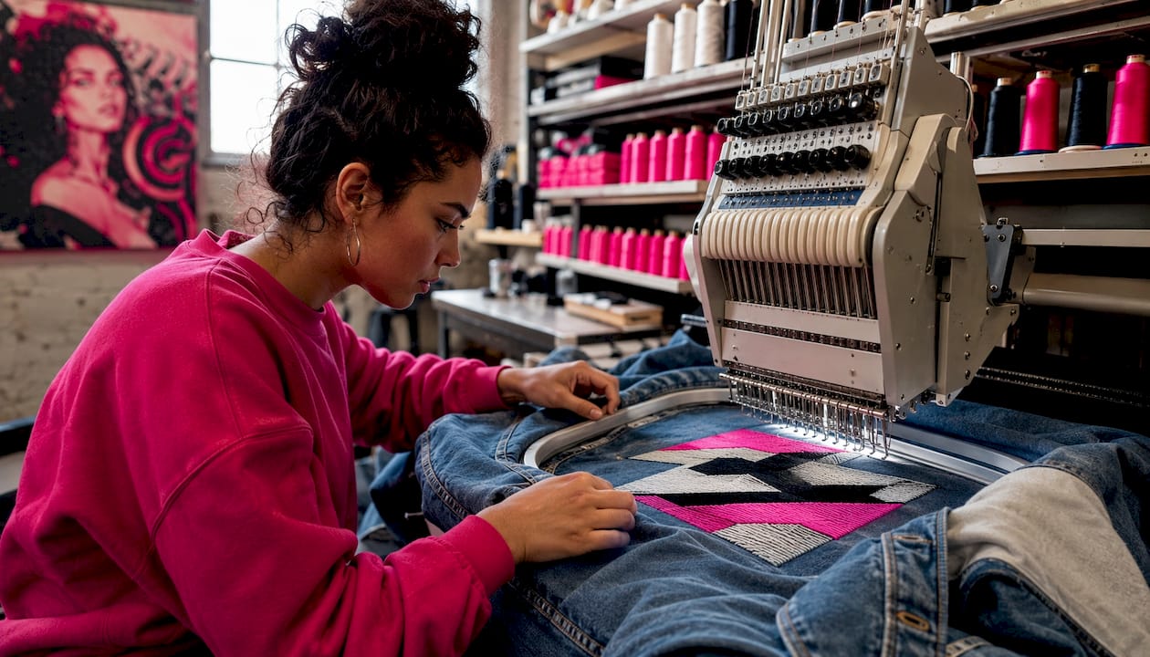
For board-inspired brands translating their visual identity into apparel, embroidery works particularly well for logos, badges, and typographic marks that need to project permanence. The tactile quality of raised thread against fabric communicates a level of care and investment that resonates with audiences who scrutinize graphic authenticity as a proxy for brand credibility. A well-executed embroidered chest badge on a heavyweight hoodie carries a different cultural signal than the same design screen-printed, and experienced designers use that distinction deliberately.
Pros and cons:
- Pro: Exceptional durability; embroidered graphics outlast the garment itself in most cases.
- Pro: Premium tactile and visual quality that elevates brand perception.
- Pro: Colorfast and resistant to fading, cracking, or peeling under any washing conditions.
- Con: Higher per-unit cost, particularly for complex designs with many color changes.
- Con: Design complexity is limited; fine linework, gradients, and photographic detail do not translate to thread.
- Con: Digitizing fees add upfront cost, and adjustments to the file require re-digitizing.
Pro Tip: Embroidery rewards simplicity. Reduce a complex board graphic to its essential geometric or typographic core before digitizing, and the resulting embroidered badge will carry more visual authority than a faithful but muddied reproduction of the full composition.
5. Sublimation printing: all-over vibrancy for synthetic fabrics
Sublimation printing achieves something no other technique can: a graphic that becomes part of the fabric rather than sitting on it. The process uses heat and pressure to convert dye from a solid to a gas, which then bonds permanently with polyester fibers at a molecular level. The result is a print with no added thickness, no hand feel on the surface, and colors that are as vivid on the hundredth wash as on the first.
The visual impact of sublimation is unmatched for all-over designs, where the graphic wraps seamlessly across seams and around the entire garment without the registration challenges that plague other methods. For apparel brands drawing on the bold, maximalist compositions of board art, sublimation offers a canvas with no practical size limit and a color range that includes photographic gradients, fine detail, and deep saturated tones simultaneously. The constraint is absolute: sublimation works only on polyester or polyester-blend fabrics with a high synthetic content. On cotton, the dye has no fiber structure to bond with, and the result is a washed-out, unusable print.
Pros and cons:
- Pro: All-over print capability with no seam registration issues.
- Pro: Permanent color bonding means exceptional wash durability and no cracking or peeling.
- Pro: No added thickness or texture; the garment retains its original hand feel.
- Con: Restricted to polyester and high-polyester blends; incompatible with natural fibers.
- Con: Cannot print white or light colors on dark polyester, as the dye is transparent.
- Con: Higher per-unit cost for short runs due to paper and ink consumption.
Pro Tip: When designing for sublimation, build the graphic at the full garment dimensions from the start. Scaling up a composition designed for a chest print to an all-over layout almost always reveals compositional weaknesses that are invisible at smaller sizes.
6. Vinyl printing: crisp graphics with tactile variety
Vinyl printing, also called heat-transfer vinyl or HTV, involves cutting a design from a sheet of vinyl material using a digital cutter, then heat-pressing the cut graphic onto the garment. The range of available vinyl finishes, including matte, gloss, metallic, holographic, and flock (a velvety, raised texture), gives designers a toolkit of tactile and visual effects that no other single method provides. A metallic vinyl number on a jersey reads entirely differently from the same number in flock, and that distinction is a legitimate design decision, not merely a production variable.
The visual character of vinyl graphics is defined by clean, sharp edges and flat, unmodulated color fields. This makes the technique ideal for lettering, numerals, geometric shapes, and graphic blocks where precision and legibility are the primary requirements. Gradients and photographic detail are not achievable within a single vinyl layer, though layering multiple vinyl colors can produce limited tonal variation.
Pros and cons:
- Pro: Wide range of finishes (matte, metallic, flock, holographic) unavailable in other methods.
- Pro: Sharp, precise edges with no ink bleed or registration variance.
- Pro: Minimal setup cost; single-color designs require no screens or digitizing fees.
- Con: Multi-color designs require layering, which adds production time and can create visible seams between layers.
- Con: Vinyl can crack or peel at flex points, particularly on stretchy fabrics, if not applied correctly.
- Con: Not suitable for complex illustrations or designs with more than four or five distinct color areas.
Pro Tip: Flock vinyl on a heavyweight cotton fleece creates a tactile experience that photographs beautifully and wears with a premium feel. For brands whose identity leans into texture and craft, a single flock graphic can communicate more about brand values than a full-color print.
7. Raised silicone printing: dimension and luxury on fabric
Raised silicone printing uses a specialized silicone-based ink that, when cured, produces a durable, rubbery, three-dimensional texture on the fabric surface. The effect sits somewhere between puff printing and embroidery in its visual register: more graphic and geometric than embroidery, but with a premium, almost industrial quality that puff printing cannot match. Silicone inks are inherently flexible, which means the raised graphic moves with the fabric without cracking, even on performance materials that stretch significantly during wear.
The aesthetic impact of silicone printing is immediate and tactile. A silicone-printed logo on a technical jacket or a performance tee communicates precision and quality in a way that resonates with audiences who associate board culture with performance-driven design. The technique is particularly effective for tonal or monochromatic graphics, where the three-dimensional texture carries the visual interest rather than color contrast.
Pros and cons:
- Pro: Exceptional durability; silicone resists cracking, fading, and peeling even on stretch fabrics.
- Pro: Premium tactile quality that differentiates garments at the point of touch.
- Pro: Compatible with performance and technical fabrics where other raised-print methods fail.
- Con: Higher production cost due to specialized inks and equipment requirements.
- Con: Color range is more limited than standard plastisol or DTF; complex multi-color silicone prints are expensive.
- Con: Design complexity is constrained; fine linework and small text do not translate well to the raised silicone medium.
Pro Tip: Silicone printing performs best on designs with bold, simple geometry. A single oversized silicone motif on a technical fabric garment creates a tactile signature that becomes part of the brand’s physical identity, something consumers remember and seek out.
8. Graphics as brand identity: what designers and brands know
The most sophisticated understanding of how board graphics influence clothing comes not from production specs but from the design philosophy that precedes them. Brands that build lasting visual identities treat their graphics as an evolving wardrobe rather than a seasonal checklist, developing core graphic systems that include badges, motifs, typographic marks, and pattern elements that can live across every product and touchpoint simultaneously.
This approach, which brands like Harley-Davidson have practiced for decades with their bar-and-shield variants and Willie G Skull icon, creates a visual language that audiences internalize over time. In streetwear and board-culture apparel, the same principle applies: a recurring skull badge, a signature color relationship, or a compositional approach to placement becomes the brand’s signature before any logo does. The influence of skate art on fashion has always operated through this accumulation of motifs, from the Ripper deck graphic of 1983 to the graffiti-inflected typography that defined a generation of streetwear.
Inclusive graphic design is another dimension that experienced designers navigate with care. As Niche Snowboards’ design director noted in discussing the Minx board, creating a graphic that resonates with female athletes does not mean defaulting to pink. The goal is modern, sophisticated, and edgy aesthetics that carry genuine attitude, a principle that applies equally to any demographic assumption a brand might be tempted to make. Offering multiple graphic options for a single product shifts power from brand assumptions to consumer identity preference, which broadens appeal without compromising visual coherence.
Authenticity remains the variable that separates graphics with cultural traction from those that fail commercially and culturally. Audiences who grew up with board culture scrutinize graphics for genuine connection to the communities and references they claim. A graphic that misses that mark does not just underperform; it signals to the audience that the brand does not understand its own cultural position. Style guides that coordinate color palettes, themes, and emotional resonance across an entire line, as Burton’s design team has practiced for decades, prevent the disjointed aesthetics that result from treating each graphic as an isolated decision.
The role of human-centered design in this process has come into sharper focus as generative AI tools enter the production workflow. Brands that have experimented with AI-assisted graphics, including Ride Snowboards with their Shadowban topsheet, emphasize that the human creative process remains central: the AI output required more than 80 iterations and extensive refinement inside standard design programs before it reached production. The audience’s trust in a graphic’s authenticity depends on visible human input, and that trust is not a sentiment; it is the mechanism through which graphic streetwear identity generates loyalty and cultural longevity.
- Graphics tell stories specific to cities, cultures, and communities, turning apparel into identity declarations.
- Consistent graphic libraries, developed as style guides with coordinated palettes and themes, build visual language that audiences recognize across seasons.
- Placement decisions (large front print, back print, chest badge) communicate different intentions, and audiences read those choices as part of the overall message.
- Texture, placement, and visual layering in graphics dramatically influence how consumers decode and engage with apparel identity.
- Personalized graphic options, as Czt practices through its custom couture design services, give consumers agency over their own identity expression within the brand’s visual framework.
9. Artwork resolution and file preparation for apparel graphics
Every printing technique discussed above has a specific set of file requirements, and getting those requirements wrong at the preparation stage produces results that no amount of production skill can correct. Resolution, color mode, file format, and artwork scale are the four variables that determine whether a graphic translates faithfully from screen to fabric.
For screen printing, artwork should be prepared as vector files (Adobe Illustrator AI or EPS format) with each color on a separate layer. Vector graphics scale without quality loss, which matters when a chest-sized design needs to be adapted for a sleeve badge or a full-back print. Raster elements embedded in a screen-printing file should be at a minimum of 300 DPI at the final print size; anything lower produces visible pixelation in the halftone dots that build tonal areas.
DTG and DTF printing accept raster files, but the resolution standard is higher than most designers expect. Files should be prepared at 300 DPI at 100% of the intended print size, in RGB color mode for DTG (the printer’s RIP software handles the conversion to the ink set) and in CMYK for DTF transfers. Transparency and soft edges render accurately in both methods, which is one of their advantages over screen printing for complex compositions.
Sublimation artwork requires the file to be built at the full garment dimensions, which for an all-over print means working with very large files, often exceeding 5,000 pixels on the longest dimension at 150 DPI. The color profile should be sRGB, as sublimation inks shift significantly during the heat-transfer process, and experienced operators use ICC profiles specific to their ink and paper combination to predict the final color output accurately.
Embroidery digitizing is a separate discipline from graphic design. A vector or high-resolution raster file is the starting point, but the digitizer must manually assign stitch types, directions, densities, and sequences to every element of the design. Fine linework thinner than 1.5mm, gradients, and photographic detail cannot be reproduced in thread; the digitizer will simplify these elements, and the designer should anticipate that simplification by providing a version of the artwork that has already been reduced to its essential forms.
Pro Tip: Always request a physical strike-off or embroidery sew-out before approving any graphic for production. Color management between screen and fabric is imprecise enough that a physical sample is the only reliable proof, regardless of how accurate your monitor calibration is.
Key Takeaways
The printing technique you choose to execute a board-inspired graphic directly determines its aesthetic impact, durability, cultural resonance, and cost structure across every garment it touches.
| Point | Details |
|---|---|
| Graphics precede all other garment attributes | Consumers read the graphic before the brand name, fabric, or fit, making it the primary brand identity vehicle. |
| Technique shapes aesthetic and cultural signal | Screen printing delivers bold opacity; DTG delivers photographic detail; embroidery signals premium craft. |
| File preparation determines print fidelity | Vector files at 300 DPI for screen and DTG; full-garment dimensions for sublimation; simplified forms for embroidery. |
| Core graphic systems build lasting recognition | Recurring motifs and badges across apparel lines create visual language audiences recognize before reading any text. |
| Authenticity requires visible human input | Audiences scrutinize graphics for genuine cultural connection, and human-refined designs retain perceived authenticity. |