![CZT [CITI-ZEN-THEORY]](http://czt.rocks/cdn/shop/files/CZT_-_Brand_PINK_Label_1_330x.png?v=1774104725)
![CZT [CITI-ZEN-THEORY]](http://czt.rocks/cdn/shop/t/61/assets/CZT-Fast-Logo---Blue-Grey_330x.png?v=98224836737033641471695502660)
![CZT [CITI-ZEN-THEORY]](http://czt.rocks/cdn/shop/files/CZT_-_Brand_PINK_Label_1_170x.png?v=1774104725)
![CZT [CITI-ZEN-THEORY]](http://czt.rocks/cdn/shop/t/61/assets/CZT-Fast-Logo---Blue-Grey_170x.png?v=98224836737033641471695502660)
Typography's Role in Custom Streetwear Design
Typography in custom streetwear is the primary visual element that communicates brand identity, attitude, and cultural allegiance before a single word is consciously read. The role of typography in custom streetwear goes far beyond decorative lettering. It is the composition that signals whether a brand belongs to the streets or to a boardroom, whether it speaks to skaters or to collectors, whether it carries weight or disappears into noise. At Czt, we have watched typography evolve from a background detail into the defining force of streetwear aesthetics, and understanding that shift changes how you design, produce, and connect with your audience.
How typography shapes brand identity in custom streetwear
Typography is a brand asset, not a styling choice. The typeface on a hoodie or tee communicates personality, cultural roots, and credibility in the same instant that a logo does. Typeface choice shapes brand narrative the way a graffiti tag shapes a wall: the letterform carries the message before the meaning registers.
Strong streetwear brands operate on a strict discipline. Brands like Supreme and Stussy maintain visual recognition by limiting fonts to one or two per design. That restraint is not minimalism for its own sake. It reduces cognitive load, builds recognition across seasons, and signals a brand that knows exactly who it is.
Consumer trust follows typographic confidence. 75% of users judge credibility by visual design, with typography as a decisive factor in first impressions. That statistic applies equally to a website and to a chest print on a heavyweight fleece. Poor font choices read as amateur, and amateur reads as untrustworthy.
- Primary display font: This is the voice of the brand. It appears on the most prominent placement, carries the most visual weight, and defines the emotional register.
- Secondary utility font: This supports the display font in smaller applications like care labels, back-neck prints, and secondary graphics. It should complement without competing.
- Cultural authenticity: Fonts borrowed from graffiti culture, punk zines, or Japanese woodblock printing carry subcultural weight. Using them without understanding their origin produces designs that feel hollow.
- Consistency across pieces: A two-font system applied across every garment in a collection creates a visual identity that customers recognize on a rack from three feet away.
Pro Tip: Before committing to a font, print it at actual garment scale on paper and hold it at arm’s length. What reads beautifully on screen often loses legibility and character at 12 inches on a moving body.
The role of typography in shaping fashion brand identity is well documented in professional design circles. Brands that treat their typeface as seriously as their colorway build visual equity that compounds over time.
What typographic principles are critical in custom streetwear design?
Apparel typography behaves like signage. It must register in motion, in fragmented attention, and often from a distance. Clothing typography needs clear contrast and deliberate spacing to communicate effectively during those brief, distracted moments of visual contact.
The principles that govern screen design do not transfer directly to fabric. Fabric moves, folds, and catches light differently than a monitor. Typography designed for screens requires exaggerated spacing and hierarchy adjustments to maintain legibility once printed on a garment that shifts with every step.
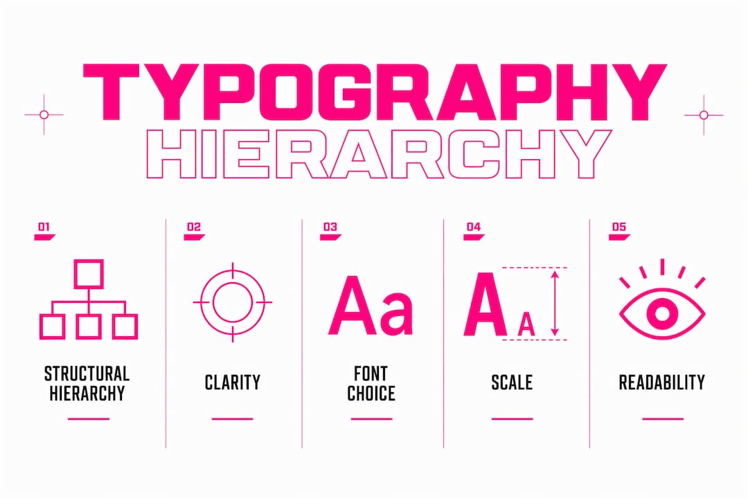
- Establish a clear hierarchy. The most important word or phrase must be the largest, boldest, and most visually dominant element. Viewers should grasp the message in under two seconds. Decorative overload collapses that hierarchy and loses the reader entirely.
- Exaggerate your spacing. Letter spacing and line height that feel generous on screen will feel tight on fabric. Add 10–20% more tracking than you think you need, then test on a physical print.
- Prioritize contrast. Dark ink on light fabric and light ink on dark fabric are the foundational rules. Mid-tone combinations create legibility problems that no amount of clever font choice can fix.
- Limit decorative elements. One display font with strong character is more powerful than three competing decorative faces. Each additional font introduces visual noise that dilutes the message.
- Test at production scale. A design that looks balanced at 100% zoom on a 27-inch monitor may feel cramped or oversized at actual chest-print dimensions. Always proof at true scale before finalizing.
Pro Tip: Sketch your layout on a garment template at actual size before opening design software. The physical constraint of a chest panel or sleeve forces better compositional decisions than an infinite digital canvas.
Structural hierarchy beats decorative overload every time. The most aesthetically intriguing streetwear typography is almost always the most disciplined: one strong idea, executed with precision, scaled to the body.
Serif vs. sans serif vs. custom fonts: which works for streetwear?
Font category is not a neutral choice. Each typographic style carries semiotic weight, a set of cultural associations that viewers absorb before they read a single word.
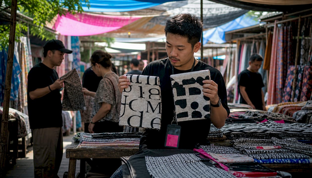
Serif fonts signal heritage, exclusivity, and craft. Luxury brands commission bespoke letterforms that make time visible and craftsmanship apparent. High-contrast serifs like Didot create what designers call visual friction: a deliberate pause that invites the viewer to look longer rather than skim. In streetwear, serifs work best for brands positioning themselves at the premium end, where the garment is meant to be studied, not just seen.
Sans-serif fonts express modernity, directness, and urban energy. Geometric sans-serifs like Futura or Helvetica communicate minimalism and confidence. They read fast, scale cleanly across sizes, and reproduce well across printing methods from screen printing to embroidery. Most mid-market streetwear brands default to sans-serif for exactly these reasons.
Custom display typefaces are the most powerful option for brands serious about visual identity. A custom letterform is, by definition, unreplicable. It carries the brand’s narrative in its curves and angles, and it cannot be knocked off by a competitor who simply downloads the same free font.
| Font style | Emotional signal | Best use case | Production consideration |
|---|---|---|---|
| High-contrast serif | Heritage, exclusivity, craft | Premium drops, limited editions | Requires clean printing; thin strokes can break at small sizes |
| Geometric sans-serif | Modern, bold, minimal | Core collections, logo tees | Reproduces reliably across all print methods |
| Script or brush | Handmade, personal, expressive | Capsule collections, artist collabs | Legibility drops quickly at small sizes |
| Custom display | Unique, narrative-driven | Brand identity anchor pieces | Higher design cost; strongest long-term equity |
The choice is never purely aesthetic. It is a declaration of where your brand sits in the culture, who it speaks to, and how seriously it takes its own visual language.
How typography drives production efficiency and market success
Text-based designs are faster to produce, easier to adapt, and more commercially resilient than illustration-heavy graphics. Text-based designs take 2–5 minutes to produce versus 30–60 minutes for illustration-heavy designs, and they face lower rejection rates in marketplaces. That production gap compounds across a full season of releases.
The adaptability of typographic design is its most underrated commercial advantage. Changing the wording alone repositions a design for an entirely different niche or audience without rebuilding the layout. A brand can serve skaters, parents, and eco-conscious consumers with the same typographic framework by adjusting the copy and colorway.
- Limit fonts to reduce printing costs. Every additional font weight or style added to a design can increase setup costs for screen printing. A two-font system keeps production straightforward and consistent.
- Outline all fonts before sending files to production. Failure to outline fonts is a common reason final prints do not replicate the design correctly. Outlining converts live text into vector shapes, preventing font substitution and layout shifts at the printer.
- Use vector formats for all typographic elements. Rasterized text loses crispness at production scale. Vector files maintain edge quality regardless of print size.
- Test colorways before full runs. Typography reads differently on black, white, and mid-tone fabrics. A single test print across your planned colorways prevents costly reprints.
Czt’s approach to personalized streetwear design reflects this philosophy directly. Typography-led pieces form the backbone of collections that can be customized quickly, produced responsibly, and worn with genuine conviction.
Key Takeaways
Typography is the single most powerful design tool in custom streetwear, shaping brand identity, consumer trust, and production efficiency in equal measure.
| Point | Details |
|---|---|
| Typography signals brand identity | Font choice communicates personality and cultural credibility before a viewer reads a single word. |
| Two-font discipline builds recognition | Limiting designs to a primary and secondary font reduces cognitive load and strengthens visual equity. |
| Apparel requires exaggerated hierarchy | Spacing and contrast must be amplified beyond screen standards to maintain legibility on moving fabric. |
| Font category carries semiotic weight | Serifs signal heritage and exclusivity; sans-serifs express modernity; custom typefaces build unreplicable identity. |
| Text-based designs accelerate production | Typographic designs produce in minutes, adapt to niches by changing copy, and face lower marketplace rejection rates. |
Typography’s place in the culture, from where we stand
Typography has always been the backbone of streetwear, even when the culture did not name it that way. We grew up watching youth frolicking dangerously to the soundtrack of hardcore skate videos, and the lettering on those boards and tees was never incidental. It was the declaration. The font was the flag.
What has shifted is the level of intentionality. Early streetwear typography was raw, borrowed from graffiti, punk zines, and protest placards. That rawness was its power. Today, the most compelling brands in the space are those that honor that heritage while applying genuine typographic discipline. They understand that a custom letterform is not decoration. It is the brand’s voice made visible.
The challenge we see most often is designers treating typography as the last decision rather than the first. They build a garment concept, choose colors, source materials, and then pick a font from a free library in the final hour. That sequence produces forgettable work. The typeface should be chosen before the colorway, because it defines the emotional register that everything else must serve.
At Czt, we believe that material innovation and typographic intention belong in the same conversation. A garment made from recycled materials and printed with a thoughtless font is still a missed opportunity. The composition must be complete.
— Czt
Czt’s custom streetwear: where typography meets craft
Typography-led design is at the heart of what Czt builds. Every piece in our collections, from the Botanic Camo line to our custom couture offerings, treats letterforms as a core design element rather than an afterthought.
Czt’s custom apparel design service gives you the tools to build a visual identity that is genuinely yours, with typographic choices that reflect your culture, your values, and your aesthetic. We work with recycled materials and production methods that minimize waste, so the garment you wear carries intention at every level. Whether you are building a brand from scratch or adding a signature piece to your wardrobe, explore what Czt’s one-of-a-kind apparel designs can do for your vision.
FAQ
What is the role of typography in custom streetwear?
Typography is the primary visual element in custom streetwear that communicates brand identity, attitude, and cultural belonging instantly. It shapes consumer perception before any other design element registers consciously.
How many fonts should a streetwear brand use?
Strong streetwear brands limit designs to a two-font system: one primary display font and one secondary utility font. This discipline builds visual recognition and reduces production complexity.
Why do luxury streetwear brands prefer serif fonts?
High-contrast serifs like Didot create visual friction that signals exclusivity and craftsmanship, inviting viewers to look longer rather than skim. Luxury brands use this deliberate pause to communicate heritage and premium positioning.
How does typography affect streetwear production speed?
Text-based designs produce in 2–5 minutes compared to 30–60 minutes for illustration-heavy graphics, and they face lower rejection rates in marketplaces. Changing the wording alone can reposition a design for a new niche without rebuilding the layout.
What is the most common typography mistake in apparel design?
Failing to outline fonts before sending files to a printer is the most common error. It causes font substitution and layout shifts that make the final print differ from the original design.
Recommended
- Personalized Streetwear Looks: 9 Bold Style Examples – CZT [CITI-ZEN-THEORY]
- What Is Custom Couture Streetwear: A Style Guide – CZT [CITI-ZEN-THEORY]
- Examples of One-of-a-Kind Apparel Designs to Inspire You – CZT [CITI-ZEN-THEORY]
- Material Innovation in Streetwear: Style Meets Ethics – CZT [CITI-ZEN-THEORY]